0 Comments
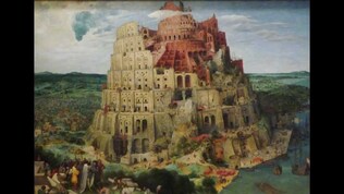 Artwork information Artist: Pieter Bruegel the Elder Title: The Tower of babel Date: 1563 Style: Flemish Mannerism Provenance: Collection of Emperor Rudolf ll Physical Dimension: w155 x h114 cm Type: Painting = the Elder I chose this artwork because I liked all the detail in it and the closer you look the more you see. I have never heard of this artwork before or heard of the artists name. It really popped out because I liked how the building looked and the landscape around it. I have never heard of the tower of Babel before either.
The artwork is about the research on the tower of babel when they are building it. The artist created it because he was fascinated and he left a whole in the front and some on the bottom to show that they are building it. Yes because you can see the workers when you zoom in and the building is still unfinished and has very good detail in it to see what is going on. It definitely is also an eye catcher and it is fun to look was with all the details. It is put together nicely and neat. 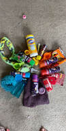 The three primary colors Three secondary colors
- Yellow - Orange -Red - Purple - Blue - Green The color found at the top of the circle is usually yellow since it is the brightest I had the hardest time finding the color orange. I guess we don't own a lot of orange things All of the silly string I thought it was funny because not a lot of people have that stuff laying around The lysol spray because probably everyone who sends you a picture of this has something lysol in there yellow category . The color was yellow I chose to do upcycle to show the beautiful in the world. I chose photos from everywhere I went to before. It reminds me that there is so many more places to go and that even though I am trapped at my house I have to see the beauty around it. I used the app Pic-Collage because I am familiar with how it works because I used to before. The items I have in my college is the rivers from my backyard and there is 3 different pictures. Then there is the ocean in Florida and the view of the town from my hotel bedroom in Florida. Then the picture with the lights hanging are from Seaworld. Then there is a couple pictures with snow in it from this past winter. I think snow is beautiful but I hate how cold it is. On the bottom is a picture from the first time I rode an airplane. My favorite picture is with a stop sign because it is such a pretty picture but yet so simple. There hasn't been simple in the world for a long time. I like how my work turned out because I love the pictures and I love how it shows the beauty. Art can raise the environmental issues because it can show how bad the pictures look and they can hang them up in certain places so people can see. Like by recycling bins and garbages to show everyone what is going on when they throw something in the garbage and not the recycling. So this is very very late. But I finally got inspired to get up and do something with art and what I started doing is painting my shoes. The white air force ones I have I decided to paint. I really like space so I decided to a solar system type them on the nike symbol. it is not quite done yet but here is some pictures. The limitation I chose was how could I paint those planets and stars in such a small area. So I painted with a pencil to make the tiny objects and designs. I have a lot more plans with these shoes. 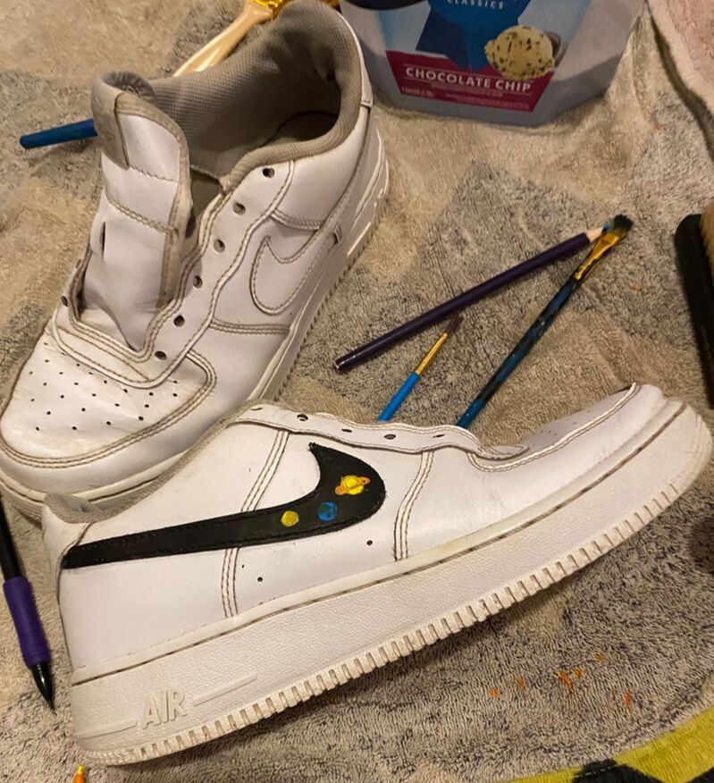 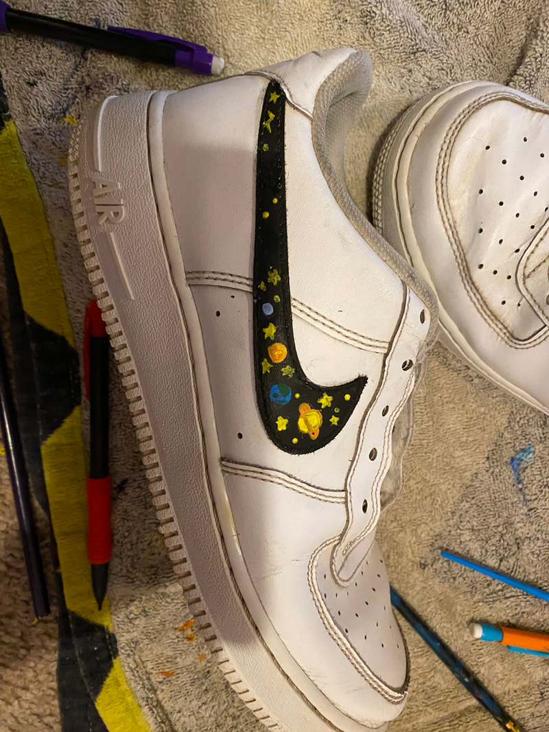 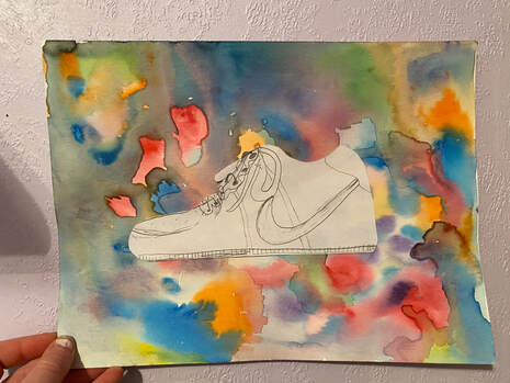 ;For this object artwork I did watercolor and then I drew out a shoe on a white piece of paper and i glued the shoe to my
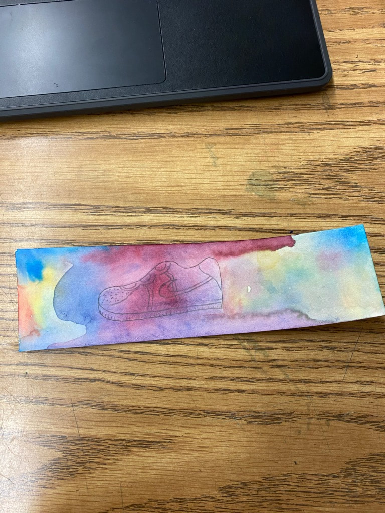
paper to make the watercolor the background. I did this because I really like shoes and the shoe I drew is my favorite pair and I wear them all the time. I finished this artwork at home and I brought the watercolor paper from school from when I did it there. The artist Sarah Lamb uses fruit to focus in on her painting and I thought it looked cool so that's what I chose to do. i didn't want to use a boring background and I really like the watercolor so I chose use that. I never really used watercolors before in this type away so that was new for me. One thing I would have done different is not use so much water because as you can tell it got dark in some spots because it mixed together. I practiced the watercolor though on multipole things and I think I drew the shoe over 5 times. 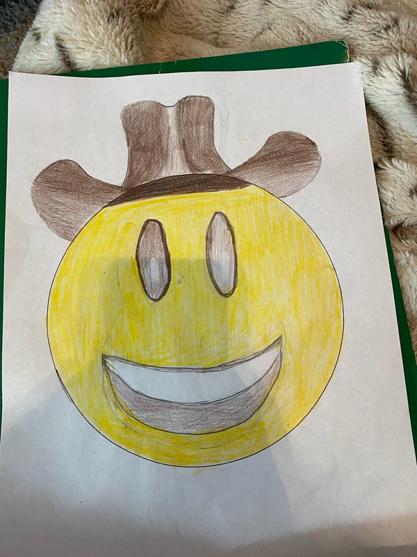 Ever since we left school I
have been helping mom and chris with the farm work, like milking cows and feeding calves. So that is why I chose this emoji. For the landscape artwork I wanted to do a lot of different things. So I tried a lot and that wasted a lot of time and now I do not have the completed thing done. I am thinking about definitely a sunset with maybe sunflower or some water.
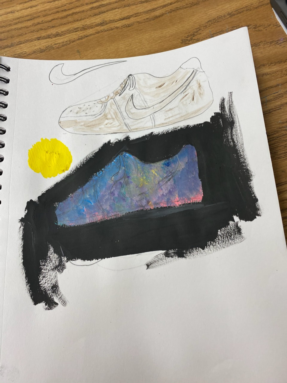
For this artwork I chose to draw my shoe. I sketched out 2 ideas in my sketchbook as seen in the first picture. I drew out a realistic drawing of my shoes with dirt too make them look old and used because that is what they are. I use them pretty much everyday. Then I drew out a shoe and put a punch of different colors in it, to give it like a galaxy thing and in the black part i was going to put splatters of yellow paint for stars. Then in the second picture I was testing out water colors and I also really liked that too. I still don't know what I am doing there is a lot of options.
|
AuthorMy names Kloe, I have a dog named Dixie and she is annoying. Archives
May 2020
Categories |
 RSS Feed
